
There are a number of ways you can drive traffic to your website these days, and using such techniques are very important, because if people don’t know about your site, or they can’t find it, your Internet presence is doomed to remain small, and your reach very limited. So by all means, use SEO optimization, seed the social media with references to your site, and encourage inbound links in every way possible – but be aware that the job doesn’t end there.
Getting visitors to your website is only half the battle; keeping them there is the real trick. You might have visitors in droves to your site, but then they might take one look at the content or the layout, and they’re instantly gone, probably to a competitor’s site. Funneling visitors to your site is only Step 1 of the process – Step 2 is keeping them in the funnel, and progressing them toward whatever desired action you have in mind, for instance making a purchase.
In order to accomplish your end action, you need to understand why it is that visitors might be leaving your website. When you know the main reasons for such abandonment, you can take corrective measures to avoid all those reasons, and instead provide more reasons for visitors to stay and spend significant time at your site. Time enough to buy or contact you.
Design Is Outdated
The old saying about first impressions holds true – for websites as well as for meeting new people – you may never get a second chance to make a good first impression. When a visitor encounters a website whose design looks like a wall of text, there’s just no appeal and no reason to hang around.
Website design has become a very visual undertaking, and survey after survey has made it crystal-clear that photos, videos, and other graphics are the elements which provide the most appeal to users. Appealing color schemes, font styles, and easily readable text can also contribute to holding the attention of a visitor. Don’t overlook design features on your website, because if you don’t have that appealing design, the rest of your content won’t even matter.
Navigation Is Unclear
If visitors cannot clearly see how to navigate around your website, they’ll be scurrying away before they’ve even clicked on anything. One of the most common mistakes in this area is to be placing links in unexpected positions, rather than at the top or along the side of a page. The labels for your links should also be clearly descriptive of what the user will find at the linked location.
Using dropdown menus is also not the best idea, because the selections only become visible after clicking in the dropdown box. One good way to discourage users from staying is to place too many navigational links along the side of a page – it looks way too busy, and lacks the simplicity that most visitors prefer.
Site Lacks Personal Connection
Personal connection to users means relevance, and if your site has no relevance to visitors, they won’t stay long enough to navigate past the landing page. The content of your website has to speak to visitors in some way, i.e. it must fulfill a need or desire, or it must address a pain point that the user is seeking to overcome.
If you aren’t solving a problem by providing them with a product or service they need to own, or if you aren’t supplying useful information that they are seeking, you haven’t made the necessary connection to your visitors. And that means there’s really no point in them hanging around any longer.
No Clear Calls-To-Action
This is a grievous error, because you have the visitors at your website, and maybe you even have their attention and their interest, but there is no clear way to close the deal. If you’ve done everything right up to this point, but you don’t provide a clear call to action, the visitor to your site won’t know what is expected, and will probably just leave in frustration. There should be a crystal-clear call to action on every page of your website, or at least a pointer to the single page which clearly identifies the action you’d like your website visitors to take.
Calls To Action Aren’t Relevant Or Appealing
Most of the time, calls to action should be about contacting you via email, either for information or to schedule an appointment. Sometimes a giveaway or a discount offer will entice users to contact you as well, but in most cases, the point is to obtain a lead through that email address, who can be followed up with later. Your calls to action though, must be relevant to the target audience you’re trying to reach, and if they aren’t, you’ve probably lost a lead.
Not Mobile-Friendly And Responsive
If your site doesn’t have a format which fits mobile devices, the display presented to a visitor will make no sense at all. To obtain any kind of information from your site whatsoever, the user would have to be scrolling left, right, up, and down – and even then, it would be difficult to piece together coherent sentences of text. Very few website visitors have this kind of patience, and instead of doing all that scrolling, they’ll simply go to another site whose layout fits their mobile device.
This is in fact, a cardinal sin for website development, because the number of mobile visitors to websites these days has already surpassed the numbers from desktops and laptops. If your website isn’t mobile-friendly, it’s safe to say that you’re missing out on a majority of your potential visitors.
Your Product Or Service Benefits Are Unclear
When you offer a product or service to visitors, it must somehow solve a problem for them or fulfill a need that they have. If you’re selling a product they already have, and yours has no unique selling features which make it better, cheaper, or stronger, then they have no reason to continue reading or watching your site content.
Promises In Offers and Landing Pages Aren’t Consistent With What Is On Your Site
Inconsistency across your various marketing channels creates confusion in the minds of your website visitors. If the price of your product has three different values on three sales outlets, users probably won’t bother trying to figure out which one is valid – they’ll just go to your competitor’s site, where pricing is clearer. The same thing is true about any claims you make for your product or service – they must be consistent across all channels, because this conveys a message of reliability to observers.
Auto-Play Audio And Videos
Not all website visitors find auto-play videos and audio messages appealing – some people are just annoyed that they are being ambushed by a sales pitch or some other communication, before they’ve even had a chance to check out the site. It’s good to have those types of content on your site, but it’s better to let your visitors choose to see or hear them when they’re ready.
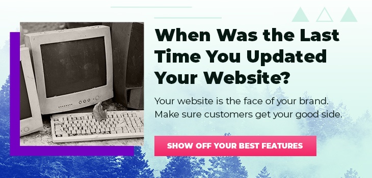
Outdated Content
Outdated content has very little value to visitors, because the pace of change has increased dramatically in the business world, and for society in general. To keep up to date with that pace of change, your content must be a current reflection of events, personal tastes, and activities which visitors can relate to.
When you don’t take the time to update your content regularly, it also shows visitors that you are not an active Internet presence, and that your company is either dormant or may even have gone out of business. Once a user has this impression of your website, they are not likely to be back again anytime soon.
Now what?
Websites are an indispensable part of doing business these days. You want to be sure that you’re getting the best results possible out of your site.
Following these steps will no doubt help you to perfect your website user experience and answer the question “Why are people leaving my website? If you’re looking for even more in-depth advice, download our free ebook on designing with marketing in mind or give us a shout, we’d love to help!