


For secure and anonymous play, top florida online casinos now accept Bitcoin and other cryptocurrencies.
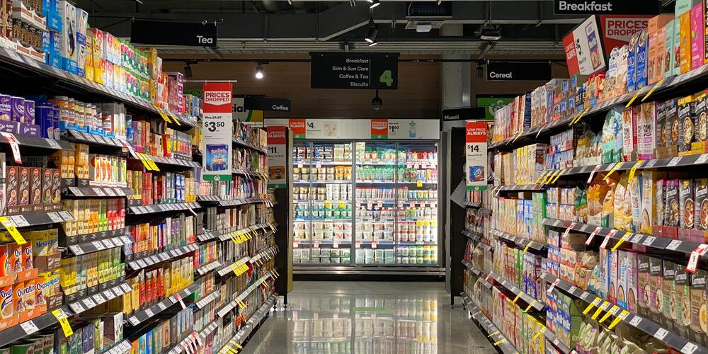
Think about the last time you bought wine. Even if you know exactly what you wanted, you probably spent at least a minute or two perusing the intricate labels and delicate designs on all the nearby bottles. And if you hadn’t already made up your mind, one of those designs might have even convinced you to buy the wine.When people are choosing products from a retail shelf, they’re looking for something that’s a little bit different. They’re scanning 25 feet of competition for something that speaks to them right away. That’s why your packaging design is so important.
Packaging is one way you can quickly set yourself apart from competitors and draw people into your brand, right from the grocery store shelf. In this article, I chat with our Design Team Leader Vanessa Wolfe about a number of ways you can improve how you approach packaging, plus some common mistakes you should steer clear of.
The Power of Product Packaging
We know people judge books by their covers and eat with their eyes, but did you know that 72% of people also say packaging design significantly affects their buying decisions? That’s a lot of discerning eyes.
“With so many people judging your product for its packaging, it’s critical to make that package really pop on the shelf,” Vanessa says. “Packaging is a key aspect of the customer experience with your brand.”
She noted four design elements in particular that can help people notice your products on the shelf, even amid ample competition:
- Color is often the entry point for the customer experience when it comes to retail shelves. The colors you choose can make it easier for people to spot your product from a distance or for it to catch their eye as they walk past. You want to choose something different enough to set yourself apart, but not so different that it no longer matches your product. (For example, toothpaste in a brown box. No, thank you.) Vanessa reminds us that you have to “respect your space while still being creative.”
- Remember that great packaging comes in all shapes and sizes. The dimensions and materials used in your packaging can also entice customers to investigate your product in a store. Vanessa points to tea brands that sell their product in tall tins instead of squat cardboard boxes. Those high-quality packaging materials and their lofty shape add a perceived degree of luxury and uniqueness that can often score a sale.
- Putting products on an end cap or POP display helps to highlight your product in high-traffic areas and encourages people to pick it up and learn more. It sends that subliminal message that yours isn’t just any old product. It’s special or successful or the best choice out there. Otherwise, why would the store bother putting it in a place of prominence, right?
- The name of your product goes a long way too. Take Liquid Death, for example. Not only does that font make you think “what in the world is that?” but the name itself is also oozing intrigue. Sure, it’s just sparkling water, but when people pick it up they feel a little edgy, a little dangerous and a little thrilled at all the crazy looks they’re getting from passersby.
With these four elements, you can speak toward your customer’s sensibilities and emulate what they want to support in a brand. “The key is to use your packaging to identify with what people care about,” Vanessa says. “This could be anything from locally sourced ingredients to organic certifications, as long as you’re speaking to what your audience feels is important.”
Just knowing what to focus on will only get you so far, though. You also need to know how to adjust your design to focus on these elements without confusing the consumer. Luckily, we have Vanessa to school us on good packaging design!
Packaging Design Tips
The beauty of custom packaging for your products is that you can find ways to highlight how it’s different from competitors right there on the package. You can communicate your brand identity through graphic design and concise messaging so people know exactly who you are when they pick up your product.
Vanessa reminds us, however, that successful packaging design is a careful balancing act of visual elements, key information and emotional appeal.
Appeal to the Right Audience
First and foremost, you need to make sure you’re selling to the right crowd. Defining your target audience and learning what they’re looking for is the first step in the design process.
“You need to know what product qualities they’re looking for, what types of packaging they want and even what colors will resonate most with that audience,” Vanessa says.
She uses the example of an eco-friendly brand to bring this design tip to life. If you have an environmentally conscious brand, you need to bring that experience to the entirety of your product.
You can focus on sustainability by using recyclable or compostable materials instead of plastic packages. You can even highlight the good your brand does with every purchase, like Ten Tree. They plant 10 trees for every purchase from their brand, and they use this as part of their marketing both online and in retail stores. Below is the tag that’s attached to all of their items.
“Brands have to get on board with the way they want people to see their products,” Vanessa says. “It’s not a fake-it-‘til-you-make-it marketplace anymore. Customers are looking for confirmation that you share their values in every product you sell.”
Keep It Consistent
“Consistency is key with your logos and branding if you want your packaging to be an effective ambassador of your brand,” Vanessa says.
She explains that the way you treat your logo (placement, size, etc.) should be consistent across all your products. It helps customers quickly recognize your product and start identifying its good qualities with your brand as a whole. Ideally, you want to place your logo close to the name of the product so customers start connecting the two in their minds.
You also want to keep your colors as consistent as possible. Vanessa notes that it’s okay to change the color scheme up between certain products if you need to differentiate them.
For example, below is an image of a variety of Sohnrey labels. You can see how they used color to indicate flavor while keeping the same foundational palette in each product.
“Sohnrey shows a great consistency in both color and branding across their products,” Vanessa says. “You can see how they’ve used bold colors to differentiate their products without straying from the foundational design.”
Display Key Information
There are qualities that make your product unique and then there are qualities that you’re legally required to share with customers. Especially with food packaging, Vanessa reminds us to make sure all that necessary information is easy to find.
Let’s go back to that wine example from the introduction. Every alcoholic beverage must list its alcohol by volume percentage on the bottle. Some brands creatively incorporate this into the label design and others simply add it under the nutritional facts. Either way, beverage brands have to find a way to include this information where consumers can easily see it.
You can use this same approach to tell people the key points that make your product different. Kettle & Fire does a great job of this with their sustainably sourced bone broth. Notice how they add the line of text under the product name to explain why their broth is special and where people can find more information.
Evoke Emotion
“Your packaging should make people feel something,” Vanessa says. “That’s how you convince them to pick up your product in the first place. You have to make an emotional connection.”
And what better way to make an emotional connection than by telling a story? Turning your value stack into a story for customers is a great way to help them identify with your brand and evoke that emotional response. Take Joy Lyn’s Beer Brittle for example:
Maybe “made in paradise” didn’t quite pique your interest, but you can’t deny the warm-and-fuzzies that come with that story on the back of the package. Can’t you imagine a family of candy makers stretching out brittle in their kitchen?
With this story, customers don’t feel like just another number on a big corporation’s quarterly reports. They’re the Good Samaritan helping out a family brand. They’ll feel connected to that story and empowered to support a brand they care about.
Things to Avoid
Business owners, marketers and graphic designers have all fallen prey to getting a little too excited about their packaging design ideas. To help you curb your enthusiasm and stay on the right track, Vanessa offers some advice on design tactics to avoid when creating your packaging.
- Stay away from design overload. There are certain brands that have busy designs on their package, but customers can still clearly see the brand and product name. The trouble comes when you try too hard to make interesting designs and you lose sight of highlighting your product and confuse customers. “Your packaging design should support your product, not outshine it,” Vanessa says.
- Don’t be wasteful. Sure you could have a package with intricate folds and extra materials, but it’ll cost you more and probably turn off customers. You want to focus on functionality before you try to get fancy with your packaging. People are looking for something that’s easy to grab, easy to open and easy to use. Vanessa notes that “extra bells and whistles in this department are rarely appreciated.”
- Limit unnecessary text. Your product packaging needs to be readable, which means you need to limit the text so the words you do have stand out. Ideally, your product name should stand out the most and you can add a line of text to briefly describe your product if needed. Aside from these two items, you want to really limit the rest of the information (on the front panel, at least) to visual elements instead of text.
- Be mindful of your messaging. “It’s okay to be creative, but you don’t want to offend or put off customers with your message,” Vanessa says. Some brands thrive on catchy or edgy messaging that matches their design, and if it matches their target audience’s personality, it works. If that messaging doesn’t match your typical buyer, though, it’s likely to just push people away.
Vanessa notes that for the most part, these common mistakes won’t necessarily keep people from noticing your brand on the shelf, but they’ll definitely discourage people from picking up your product.
Design overload, wasteful packaging, too much text and unappealing messaging all tend to frustrate consumers because they can’t immediately find their values in your product.
Time to Design Great Packaging
Now you know all the tricks of the trade, you’re ready to create packaging designs that will entice your customers. Remember, it’s not about being the fanciest label on the shelf, it’s about finding ways to connect with the right audience.
To learn a little bit more about how you can put your best foot forward with potential customers, check out our blog about brand messaging!